Wednesday 28 September 2016

Lens based Media Week.

Day 1

On the first day our task was to create a vine clip showing change. In a small group we created a short clip of Glen transporting to the other side of the building within a split second. There was a nice and simple story line to it and the clip had quite some humour to it. Everybody really enjoyed it when we showed it to the class.


For the second task we had to work in the same groups but this time create a short thirty second clip showing a problem that couldn't be resolved. For this film we decided to create a crazy lift situation. The film started of with one person in the lift who is sane and then one by one more people enter the lift who are crazy and are acting crazy and in the end it turns the one sane person crazy too. This film too had a creative story line and humour to it. I think overall this scene worked very well, it was straight to the point and interesting to watch. Also the fact that the scene starts off with the lift at floor 0 links in with the video, the 0 is a loop and the loop could represent craziness. I think to improve we could of included everybody in our group in the film as there were 2 people who were not included, more people in the lift would have created for chaos and would have added to the drama.

                                                              Click here for video clip.

Day 2

The next day we used stop motion to create a short film showing change. We looked at the works of Jan Svankmajer and Cyriak to understand what we were trying to achieve. Working in pairs, me and my partner created a short film of a worm who crawls out of an apple and ends up turning into a butterfly. The clip is short and sweet and works well. I think for my first ever stop motion film, i did well and i overall really enjoyed the task.


For the next part of the day we joined up with another pair and created another stop motion animation but we had to show a change from a 2D world into a 3D world. My group and I came up with the idea of turning one of our team members into a character who starts out in a 2D world (paper) and crawls out into the 3D world (reality) and is amazed by his surroundings. I think the story line was a great idea however i think our clip  is quite messy and we could of made it better but it still works and the class really loved it.

Click here to watch.

Day 3

Today we focused on still image rather than moving. We looked at the works of artist who focus on different aspects of photography such as line, texture, depth of field, symmetry, shadow and light. We then took the challenge to take pictures of our own that fall into these categories. This was a really great task as I learnt a lot photography and i took some really lovely photos.


Friday 23 September 2016

3D Design: Day 3

Today's task was to create bridges! We first started off by creating bridges out of paper and masking tape. We drew a curved line on a piece of A3 paper acting as a river and then we created bridges over the river. I created 5 bridges in total and each one was pretty unique. This task was more about being creative rather than practical.


I think my designs are visually appealing and interesting however they are definitely nothing like an ordinary bridge and not practical at all. If i was to spend more time on this task and improve my designs i would design something that has more structure to it and is more realistic. I would also consider using different materials and creating a bigger bridge so i can understand the problems and the challenges i would face with my design and figure out how to improve them.

The next task of the day, which was the main task, was to create a bigger bridge in groups so that Geoff's remote control car could travel across it. My group and I came up with a challenging design. We decided that our bridge would start of steep so that the car could gain speed and then there was a gap that the car had to jump over and then it would land in a tunnel and make it to the other side. This design was risky but we took the challenge and we succeeded! we created our bridge out of cardboard, bamboo sticks and sellotape. The overall structure of our bridge was strong and it supported the weight of the car very well. I think we worked very well as a team and were able to come together when there was a problem and come up with a practical solution. To improve i think we could have created a bigger tunnel as the car could have missed the hole and fallen to the ground and we would have failed our task.


Tuesday 20 September 2016

3D Design: Day 2

Today we looked at the works of different artists and designer to help inspire our work. One architect/ designer that stood out to me the most was Zara Hadid. I loved the Heydar Aliyev Center that she designed. In this building she wanted to create something unique, something which is looking at the future. The building somehow manages to show a soft, romantic side but at the same time an optimistic side. I love the design of the building and i think it works very well with the surroundings.

Zaha Hadid   Heydar Aliyev  Cultural Centre, Baku:

Our task for that day was to build a structure out of spaghetti that could hold three plastic balls. However the balls could not touch each other or touch the table. We were not allowed to use any materials other than spaghetti and glue. I first started by brainstorming some ideas down of what my structure could look like.


We then did some fun little tasks such as drawing the person next to us without looking at the paper and placing three balls on the picture and then drawing our right hand with out left and adding balls to that drawing too. I think these tasks were great as the shapes i used in my drawing helped me to think of more ideas for my structure.


I then started to create my structure. Although i had brainstormed a few ideas, i still wasn't too sure what my overall structure would look like so I made it up as i went along. I started off by creating different shapes out of the spaghetti and then i joined them all together. In the end my structure was able to easily hold two balls but i was struggling to get the third one to balance. This was because my structure was not sturdy enough and needed more support.


It was also very interesting to see what other people had created, there were some amazing ones! The next task was to protect our structures from a downward force of a basketball by filling the gaps in our structure with paper. My main method in this task was to create rolls out of paper and fill them in the gaps, i also scrunched up some pieces and added them in to. I didn't have much hope for my structure to survive as it was rather weak but surprisingly the basket ball only destroyed half of my structure and the rest was still intact!

Monday 19 September 2016

3D design: Day 1

Today was the first day of 3D design. We were asked to remember all the gifts we have ever received on our birthdays and creatively write them on a large piece of A1 paper. We were not allowed to draw any images. We took inspiration from artists such as Monique Prieto and Peter Davies. I started of by writing the words in colourful bubble writing, i also added some shapes and borders around the letters so make it look more interesting. We were them asked to cut out all the white spaces on our paper and make the paper flowly. I thought this was a great idea as it added more character to my work and just overall looked very intriguing. We were then asked create an installation by hanging our cut outs along with everyone else in out group. All of the pieces looked really great together and it was lovely to walk through the installation and read all of the different words. The last task of the day was to use up the scraps of paper and cut out silhouettes of presents we received or have always wanted to receive and place them of the floor. I think it looked really nice altogether.


Thursday 15 September 2016

Graphic week: Protest and Workshop

On our last studio day we created protest signs about something we feel passionate about. I created mine on free student travel. I personally feel that travel in London should be free for students as it is very expensive. I drew the words ‘FREE TRAVEL 4 STUDENTS’ onto A2 paper and cut them about using a scalpel. I then stuck black paper behind the original paper so that the words were clear and stood out. I felt like my sign lacked colour so for some of the letters I replaced the black paper with blue paper so it looked more interesting to read and stood out even more. I then stuck this onto a large piece of card. On the other side a did a continuous line drawing of myself. I was overall very pleased with my final outcome, i feel like it really expressed my personality.


On the last day of our project we had an introduction lesson for Photoshop and illustrator. We learned how to cut cut a background and replace it with a different background. I also created a logo of my name. This workshop was a great introduction lesson and learnt a few basic things that i will use again in the future.

Tuesday 13 September 2016

Graphics week: Portraiture

On the second studio day we did some large scale drawings of facial features. First we did some interesting quick observational sketches of a class mate. For each sketch we used a different method to draw it. The first drawing was continuous line, the second was to be drawn with our opposite hand, the third was draw with out eyes closed and the last was drawn with out mouth.


This was definitely an interesting way to draw, even though all of the proportions were off, they looked interesting and experimental, i really enjoyed this task and i think its a great way to add character into my work and make it look rather abstract.

In the next task we drew large drawings of facial features, we spent about 20 minutes on each drawing. I used a different range of mediums in my drawings. For the ear I used different tones of graphics markers, the different tones created depth and definition in my drawing and showed the areas of lights and shadow. For the eyes and ears I used a range of graphics markers, pencil, and charcoal and worked in a quick motion ensuring I captured all the detail that was visible to me. For the lips I used a pink graphic marker, this added colour to my overall piece and created character.


I really enjoyed this task as each of my drawings were drawn in a different style and had their own character and the best part was putting all of my drawings together in the end to create one big piece. From this task i realised that graphics isn't just about working on the computers and that you have to have a creative approach and work in different ways. This task made me more interested in graphic design.

Monday 12 September 2016

Graphics week: Campaigning

On our first studio day for Graphics we were given a subject in our groups – ours was celebrities. We created a mind map and from that we came up with a campaign slogan with which we created a supersize campaign poster. Our slogan was ‘Tame your Fame'. 

We explored different compositions of the three words and chose to simplify it to TYF as it was easier to fit it on and also it was sort of catchy.


With my group we narrowed our ideas down to a final design for our campaign slogan and created it. We used a scalpel to cut out the large letters on card and then covered each letter with a different colour of paper to make it stand out and give an impact. we layered the 3 letters on top of each other giving our campaign some dimension. Overall i think we all worked well in a team and came up with a good slogan. However i feel like because we abbreviated the slogan, a lot of people wouldn't know what the letters stand so perhaps it would have been better if created a bigger sign and not have abbreviated it.


Friday 9 September 2016

Utopia: The final Object

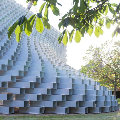
The final outcome of this project was to create an object that represents my ideal Utopian society. Looking at the serpentine pavilion and the opera house it seems that these architects are trying to create a sense of beauty in society - this relates to the idea of paradise and how everything is beautiful and perfect in paradise which is essentially utopia. I took my research further and looked into the Alhambra in Spain, this is a palace that was built by a king to represent paradise; it is surrounded by beautiful gardens and water. There is a real sense of freedom in the structure and surroundings of this beautiful palace

                                            Image result for alhambra spain

The Alhambra contains a lot of geometry patterns on the tiles, I looked into the geometry and saw how all the shapes perfectly fitted with each other, this connects with utopia and the idea of perfection and oneness. 

Image result for alhambra geometry      Image result for alhambra geometry

I felt intrigued by the geometry and looked further into different styles and patterns. The pattern that stood out to me the most was a tessellation of birds. The birds symbolise freedom. 

17 June we celebrate the birth of M. C. Escher, born 1898. Escher tessellated us for the last time in 1972.:

On the final day of our Utopia project, we had to create an object that represents my own utopia. I decided for my final object I would paint a bird as a bird symbolises freedom and my idea of a Utopian society is being free and having the power to say and do as you please. I think my idea of utopia is something that everybody would agree with, so many times in life and society we are told we can not do such things or sometimes our voices are not heard and i think its important that everybody has freedom to an extent and has a voice. I used oil paints to create a beautiful bird on a large piece of cardboard. I ensured that I seamlessly blended in all the colours on the wings and body of the bird together. I then carefully cut the bird out and attached a piece of string to it so it could be hung and look like it was flying. I was overall very please with my final outcome.


Tuesday 6 September 2016

Utopia: Drawing tasks

Today we brought in 5 objects that represent our own utopia and used these for some drawing activities. For our first task we re-created one of our objects using paper/string/tape. I recreated my object of a dead rose using paper and masking tape by tearing small bits of paper to represent the petals and layers them upon one another to create a ruffled effect. It was a challenge to create a 3D object out of paper and tape but the outcome was definitely effective and it was an interesting way to recreate our object other than just drawing it.


For the second challenge we drew a large scale drawing of one of our object, i chose the dead rose again as it was the most interesting to draw. I used a medium of fibre ink pens to create the outline and details and compressed charcoal to create depth and add dimension to my drawing.


Monday 5 September 2016

Utopia: Review of exhibition visit at the V&A - Engineering the world: Ove Arup and Serpentine Pavillion.

The first exhibition I have visited in my Utopian project was 'engineering the world by Ove Arup. This exhibition, through a chronological journey, explores the life and work of the 20th century engineer and how his work has influenced the work of other engineers. It contains unseen prototypes, models, drawings, film and photography. Some of his early work was exhibited such as the London zoo’s penguin pool and some later ones such as the Sydney opera house.


Arup was very experimental and this was shown through his creative approaches in his work using a range of materials such as concrete, metal and wood. His designs were taken from simple ideas and expanded into something more complex such as the roof structure of the Sydney opera house. As you can see below , his idea of the roof structure came from splitting a sphere into 4 sections and from those four sections taking out different size pieces ‘shells’ and bringing them together creating the abstract design of the roof.


I think through the design of the Sydney opera house, Arup was attempting to re-engineer the city based on a Utopian view of the  world, he didn’t want the opera house to be just a building but more of a centrepiece of an alternative society.


Image result for serpentine pavilion
I also visited the Serpentine Gallery at the summer house. This is designed by Bjarke Ingles -  a Danish architect. He was inspired from the idea of creating the extra ordinary out of something ordinary. He used only 3 materials and created these brick like structures and stacked them upon each other. When walking through the pavilion, i felt a sense of freedom. I was inside yet i felt like i was still out in the open because of the gaps in the bricks. This relates to my idea of a Utopian society as my perfect Utopian society is having freedom. The structure of the pavilion seems to have been inspired by the modernist movement such as the open space and fresh air.